
Our local newsrag of choice, The Guardian (né Manchester Guardian, né Guarniad) has its own font family, of 96 individual faces, commissioned in 2005 for its redesign and switch to smaller, more manageable pages. This much you know. But further, the font has been licensed for exclusive use by The Guardian, and this license expires this year. (This comes on the high authority of the typographica blog.)
I admire large public institutions that commission major typeface designs, particularly unassuming but distinctive ones like this. Whitney, designed by Hoefler & Frere-Jones for the Whitney Museum, is another chic example. To call for a major type family design is something like commissioning a great city building, or a great work of public art. It adds to our cultural heritage, while making a mark for the institution.
The Guardian is a fine paper, not so much for the news—that part is alright, maybe—but for the extras. For much of the past year or so they've been putting out posters, one a day, according to weekly series, cataloging various examples of some category. For example, one week might be themed "Birds," with each day's poster covering a subcategory like "Gulls" or "Hawks." The poster would just be a scattered arrangement of slightly dull drawings of the things, name attached. Not fascinating, but cute.
Just now they're running a series of handsome little chapbooks of poets:
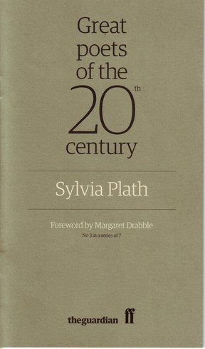
That's from a few days ago. Note how the diversity of weights in the Guardian font family allows them to set the "20" so large while keeping the strokes about the same weight as the rest of the heading.
Today's book collects from Ted Hughes, with intro by Jeanette Winterson (read it online). Each book has an author photo, a reproduced manuscript page, and original reviews from the Guardian pages.
Why do they offer these gifts? It's not in their remit as a newspaper. Perhaps it's for entertainment, to compete with the page three girls offered by every other British daily. I know which I prefer.
Surely you've seen the documentary "Helvetica"? I can't think of anyone who would appreciate it more than you...
I like Bryson, by the way! Well done.
Ay, I'd love to see "Helvetica." It's only screened once in Edinburgh, and I was out of town. Next time I'm in Boston maybe we can rent it together.
One person who'd appreciate it as much or more: home-piece shaderlab né Randy.
Re. Bryson: thanks. It was a mad period of slavish devotion and it still needs some tweaks, but I'm reasonably pleased with it.
See in particular.